Stanley Whitney: Dance the Orange
In 1981, abstract painter Stanley Whitney’s work was included in a group show at the Studio Museum in Harlem. Now, 34 years later, he is having his first New York solo museum exhibition there. The 28 luxuriant paintings on paper and canvas on view—all made between 2008 and 2015—are the best of his career.
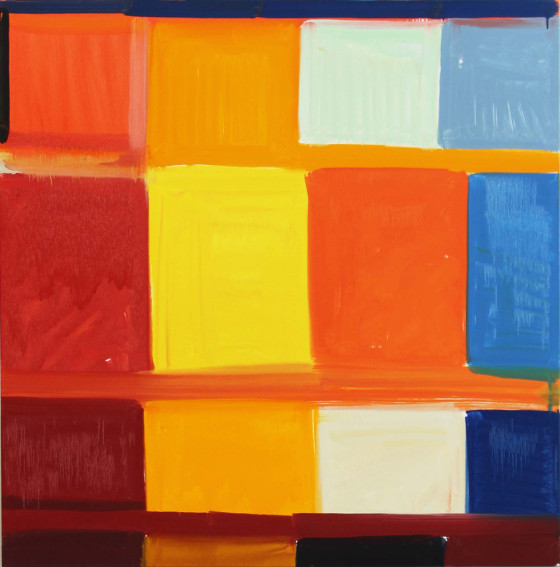
In the mid-1990s, Whitney arrived at a simple format that’s served him ever since, and to which all the canvases (and most of the works on paper) in this show adhere: A loosely constructed grid of richly hued blocks separated by narrower bands of color. In some works, the former intrude on latter from either side, suggesting a continuation of the rows into a space beyond the painting. The brushwork, when visible at all, is unfussy and workmanlike; the colors and their arrangement are the main event.
Working without a preconceived plan, Whitney starts each painting with a single block of color in the top left-hand corner. Moving from left to right and from top to bottom, he fills in the rest, finishing at the bottom right corner. This initial pass seems relaxed and, at the same time, always alert to its own progress. Later, the artist will go back, adjusting the color and treatment of certain blocks and bands.
Whitney’s variations on his theme can be as flamboyant as Elephant Memory (2014), dominated by cherry red and chartreuse, or as plain-spoken as Off Minor (2014), which starts off, like the beginning of a sentence, with a black square, then a white one, before embarking on a run of primary colors.
Whitney pulls off the difficult trick of making art about color that isn’t decorative. Like Matisse, he achieves this through attention to structure. There’s also a debt to Mondrian in the thought given to the paintings’ underlying grids.
Adding to the works’ heft are Whitney’s counterintuitive choices. Colors can be hard to identify as they buzz and fidget against one another. Placements and juxtapositions, like the almost unbroken stack of different blues running up one side of Dance the Orange(2013), or the square of flat lilac among the otherwise saturated colors of Lightnin (2009), shouldn’t work but do. The dividing ribbons, in conjunction with adjacent blocks of similar hue, form such destabilizing substructures within the paintings’ grids as the red T shape in Hearts and Brains (2012), or the dark marine L in The Blue(2012).
Whitney, who divides his time between New York and Italy, was born in 1946, and it is only in the last ten years or so that his work has garnered widespread attention. He’d remained unfashionably committed to abstraction during the 1980s ascendance of figurative painting and photo-based art, and the 1990s heyday of identity politics.
Whitney’s epiphany was that abstract paintings could touch on cultural and personal experience. Some of the works’ titles, such as My Tina Turner hint at this, as do certain works such as James Brown Sacrifice to Apollo (2008), which is infused with the bleached colors and deep shadows of Italian streets at midday, or Love Root (2008), with its twilight blue panels, overlaid with orange, conjuring city evenings.
The majority of these slow-building paintings have at their bottoms a quickening, selvedge-like row of smaller blocks whose colors, syncopations and textures are often at odds with the rest of the canvas. A staccato line of carmine, black and watery, winter-sky blue rectangles, for example, underpins the cheerful primaries and tertiaries in My Name is Peaches (2015). By contrast, the largely deep green, dull terracotta and dark blue Congo (2014) is lifted by a single panel of unlikely pastel pink in its lower right corner. More than the works’ titles or colors, it is the complexities and contradictions implied by these selvedges that give Whitney’s abstractions their connection to real life.—Anne Doran
Studio Museum in Harlem, 144 W 125th St bet Adam Clayton Powell Jr. Blvd and Malcolm X Blvd, Harlem, New York, through October 25